Most Sites Don’t Need a Redesign They Need Therapy.

July 16, 2025
Read Time
8min

Here’s the honest truth: most websites aren’t aesthetic disasters. They’ve got decent visuals, a color scheme that follows the brands' corporate identity branded colors, even a few scroll-triggered animations, that facilitate user engagement. But something they still feels… off. Users bounce. Nobody clicks. You’re constantly tweaking copy, but nothing sticks. What’s really wrong?
Your site isn’t ugly. It’s confused.
Confused UX leads to user hesitation, cognitive fatigue, and trust erosion. People don’t convert when they don’t feel confident. And the worst part? Visual redesigns can’t fix it if the problem is structural.
At Fraem GmbH, we work with businesses who don’t neccessarily need a visual overhaul they need clarity. So let’s dig into the 5 clear signs your site might be sending the wrong signals, and how to fix them with thoughtful, experience-driven design.
1. Your Navigation Has Trust Issues
Your navigation isn’t just a menu, it’s your user's orientation tool. If it’s messy, inconsistent, or overwhelming, users lose confidence fast.
1.1 Navigation Isn’t Just a Menu It’s How Users Think
Navigation is the cognitive structure of your site. It’s the difference between walking into a store where every aisle is labeled and walking into one where the signs are in Latin. Navigation is the cognitive map of your site. It is the difference between entering a store where every aisle is marked in your native language, guiding you effortlessly to what you need, and wandering through one where the signs are in Latin, leaving you lost and frustrated. Menus are often treated like an afterthought, a formality. But they’re your user’s first impression of structure and structure builds trust.
When someone lands on your site, their brain immediately starts mapping the territory. “Where can I go? What does this brand offer? Am I in the right place?” If the menu is confusing, incomplete, or inconsistent, users subconsciously label the whole brand as disorganized, which can be a significant factor influencing the trust relationship you're trying to build. Even beautifully designed visuals can’t compensate for an unclear path.
1.2 What Is Primary Navigation? Let’s Define It
Primary navigation is not every link on your site. It’s the core menu items that serve as your user’s first roadmap. Think: “Features,” “Pricing,” “Blog,” “Login,” “Contact.” These links get people to where they want to go fast. They’re what most users will use 80% of the time. It’s not your legal links in the footer. It’s not a sidebar for logged-in users. And it’s definitely not a carousel of CTAs.
When primary navigation is structured with clarity, you reduce bounce, increase confidence, and build a better first impression without changing a single visual asset.
1.3 Common Navigation Mistakes to Avoid
Even if your navigation seems “fine,” subtle issues can undermine trust. Here are three common pitfalls we see:
Hamburger menus on desktop: Many sites use hamburger menus universally, assuming minimalism is always good UX. But hiding navigation on large screens removes a vital cue users expect. On mobile, space is scarce so we hide. On desktop, we can show. If your user has to click something just to find out where they can go, you’ve already lost them.
Overstuffed menus: We’ve seen sites with 20+ links in their top navigation. The logic? “Let’s show them everything!” The result? Analysis paralysis. Users don’t know what’s important, and instead of thinking “Wow, this company does a lot!” they think, “Wow, I’m overwhelmed.”
Creative or inconsistent labels: One page says “Let’s Talk.” Another says “Contact.” Another says “Work With Us.” Technically, they go to the same place but mentally, users don’t know that. This inconsistency adds to their cognitive load, and when people have to work too hard, they leave.

1.4 What Actually Builds Trust in Navigation
Trust in UX isn’t a feeling it’s a series of positive predictions fulfilled. A user clicks “Pricing” and sees pricing. Clicks “Blog” and sees articles. If your navigation structure matches your content structure, that’s alignment. And alignment = trust.
Now, add consistency and predictability. The navigation should work the same on mobile, desktop, and tablet. Menus shouldn’t shift from the top to the side or morph into unrelated formats. Users build a mental map, and if that map keeps changing, they stop exploring
1.5 Why Confused Navigation Fails
Many websites create unnecessary friction through their top-level navigation. Dropdowns may behave differently across sections, subtly breaking user trust. Menu labels like “Explore” or “Solutions” are vague and open to interpretation. Even worse, CTA buttons crammed into nav bars can compete with essential pathways.
I’ve seen clients double their average session duration simply by cleaning up navigation. One e-commerce brand went from a 78% bounce rate to 52% after we reduced top-level items from 11 down to 6 clear options. These small choices pile up. They cause users to hesitate or get lost, which increases bounce rates and sabotages conversions.
1.6 The Real Fix: Predictability, Plain Language, and Purpose
Good navigation doesn’t happen by dumping pages into a header. It happens when you map your site around the user’s journey not your internal structure.
Here’s the formula: Keep your top-level menu limited to five to seven items. That’s about as much as the average brain can comfortably process in short-term memory. Use everyday, intuitive language don’t label a section “Solutions” when what you really mean is “Marketing Tools” or “Team Collaboration.” The more literal and user-centric your labels are, the easier the site is to navigate. Maintain consistent structure across all pages and devices. A navigation menu that shifts, collapses unpredictably, or changes format between desktop and mobile turns orientation into a guessing game. And finally, use visual cues to help users stay grounded. Sticky headers, active-page highlights, and breadcrumb trails provide subtle reassurance that they’re on the right track.
As NN/g says, “A well-designed information architecture enables people to find what they’re looking for and accomplish their goals.” — Nielsen Norman Group
2. Your CTAs Are Having an Identity Crisis
2.1 When Your Website Is Shouting at Users from All Directions
A call-to-action (CTA) is supposed to do just one thing: help the user move forward. But when your page is littered with a bunch of them “Start Free Trial,” “Book a Demo,” “Contact Us,” “Subscribe,” and “Read More” it stops being helpful. It starts feeling like five salespeople yelling different pitches at the same time.
This isn’t guiding the user. It’s overwhelming them.The result? Users either hesitate and think too much (bad), or they leave entirely (worse). This is known as choice paralysis. In UX psychology, it’s been proven that too many equally weighted choices lower action rates. People feel unsure, so they opt out. This is especially dangerous above the fold, the part of your site people see before scrolling. If you jam that space with three different buttons, users don’t feel confident. They feel lost.
2.2 Real-World Example: When Too Many Options Kill Results
Multiple competing CTAs create uncertainty: which action is right for me? Will they lead to different destinations? This hesitation often results in no action at all. For example, a B2B landing page we redesigned had three main CTAs scattered across the hero section. Guess how many users clicked any of them? Very few. Through heatmap tracking, we discovered that users hovered over all of them but clicked none. Why? Because they weren’t sure which one was the “real” next step.
After user testing, we simplified it to just one main CTA: “Start Free Trial”, and added microcopy underneath: “Takes 2 minutes. No credit card required.” Result? Conversions increased by 47% within the first month. We didn’t change the design just the clarity.

2.3 The Psychology Behind One Clear Path
Here’s the truth: people want to be guided. They don’t come to your site to analyze a list of options like they’re choosing a phone plan. They want you to show them the one best next step. This is called cognitive fluency the ease with which our brains process information. When users face multiple CTAs with unclear outcomes, their brains slow down. Their confidence drops. And low confidence = no clicks. When there’s one obvious action that aligns with their goal, action becomes effortless. That’s the goal of great CTA design.
2.4 The Power of Microcopy in CTAs
Microcopy is the small text that appears near your buttons and it’s a secret weapon for increasing conversions. While having one clear CTA is vital, how you phrase it can make or break conversions. Microcopy those small words in and around your buttons gives context and reassurance.
Because when people hesitate to click, it’s often due to fear or uncertainty: “Am I going to get charged?”, “How long will this take?”, “Is this going to spam me?”
You can ease those concerns directly with microcopy like: “No credit card required”, “Cancel anytime”, “Only takes 2 minutes”
This small text builds trust and reduces hesitation.
2.5 The Fix: Guide, Don’t Overwhelm
Assign one primary action per page that directly aligns with the user’s intent. Every page should have one job. Your pricing page? Drive trial signups. Your blog post? Encourage newsletter subs. Your features page? Push product demos.
And once you’ve decided that job, your CTA should align with it perfectly. Here’s what to do:
Choose one primary CTA per page and make it visually dominant
Add supportive microcopy to calm objections
If needed, include a secondary CTA, styled subtly (e.g. a text link or ghost button)
Use button text that focuses on what the user gets, not what they have to do
Susan Weinschenk explains this behaviorally in “100 Things Every Designer Needs to Know About People”, emphasizing that people need a clear path to act on instinct.
3. Your Buttons Look Like Decorative Boxes
Minimalist design is great until your buttons start looking like static rectangles. Users won’t click what doesn’t look interactive.
3.1 Buttons Aren’t Just Decorative They’re Directional
Buttons are supposed to be clear, actionable signposts. They exist to drive interaction. But on too many modern websites, buttons are styled more like background elements than functional tools. Flat ghost buttons, unlabeled icons, ultra-light outlines they may look clean to a designer, but they’re not doing what buttons are meant to do: get clicked.
Users shouldn’t have to guess whether something is clickable. When they do, confidence drops, friction rises, and conversions disappear. A button that looks cool but doesn’t look clickable is not a button. It’s visual clutter.
3.2 What Does “Affordance” Mean (and Why It Matters)?
In UX, affordance refers to the visual clues that tell users what something does. A button should afford clicking. It should look obviously interactive.
Imagine walking up to a door. You know how to use it because it has a handle it “affords” pulling. Now imagine a digital button that blends into the background, has no border, and uses vague text like “Go.” Users don’t feel confident interacting with it because there’s no clear signal that it’s actionable. Your site shouldn’t need a tutorial. The design should communicate how it works. If a user has to hover or guess whether something is clickable, that’s a friction point. And friction kills flow.
3.3 Accessibility Isn’t Optional Especially on Buttons
Buttons aren’t just for mouse users with 20/20 vision and Retina screens. They need to be usable by everyone including mobile users with big thumbs, people with visual impairments, and those navigating with keyboards or screen readers.
To make buttons accessible, color contrast must meet WCAG AA standards, with a minimum ratio of 4.5:1 for text. Touch targets should be large enough at least 44x44 pixels to accommodate all users. Focus states must be clearly visible, whether that’s an outline or a subtle shadow, so users can see where they are on the page. And every button must have a descriptive label. Unlabeled icons are a UX dead end. Accessibility isn’t a bonus it’s the baseline for usable design.
3.4 What Poor Button Design Actually Looks Like
We see recurring issues during UX audits that sabotage interaction. Ghost buttons, for example, often use faint borders that disappear into light backgrounds, making them hard to spot. Icon-only buttons lack tooltips or labels users don’t always know that a gear icon means "settings," and they shouldn’t have to guess.
Then there are buttons styled to look like plain text links. This ambiguity creates confusion about whether they trigger an action or navigate to another page. And when multiple buttons appear in a row without any clear hierarchy, users hesitate, unsure which one to click. If people are hovering, pausing, or skipping your buttons entirely, your design isn’t working.
3.5 The Fix: Make Buttons Obvious, Actionable, and Accessible
Improving your button UX doesn’t require a redesign it requires clarity. Start by reviewing every button on your site and asking a simple question: Would someone with no design background immediately know they can click this? If the answer is no, that’s a friction point.
Use strong visual contrast and clearly defined hover or tap states, and test them on both desktop and mobile devices. Label buttons with outcome-based language that tells the user exactly what happens next. Maintain a consistent style for your primary calls-to-action across all pages, so users begin to recognize and trust them.
Finally, make sure your buttons meet basic accessibility criteria contrast, sizing, labeling, and keyboard navigability aren’t optional. Buttons aren’t the place to express your love for minimalism. They’re where decisions happen. If users can’t click with confidence, you’re losing more than just design points you’re losing conversions.
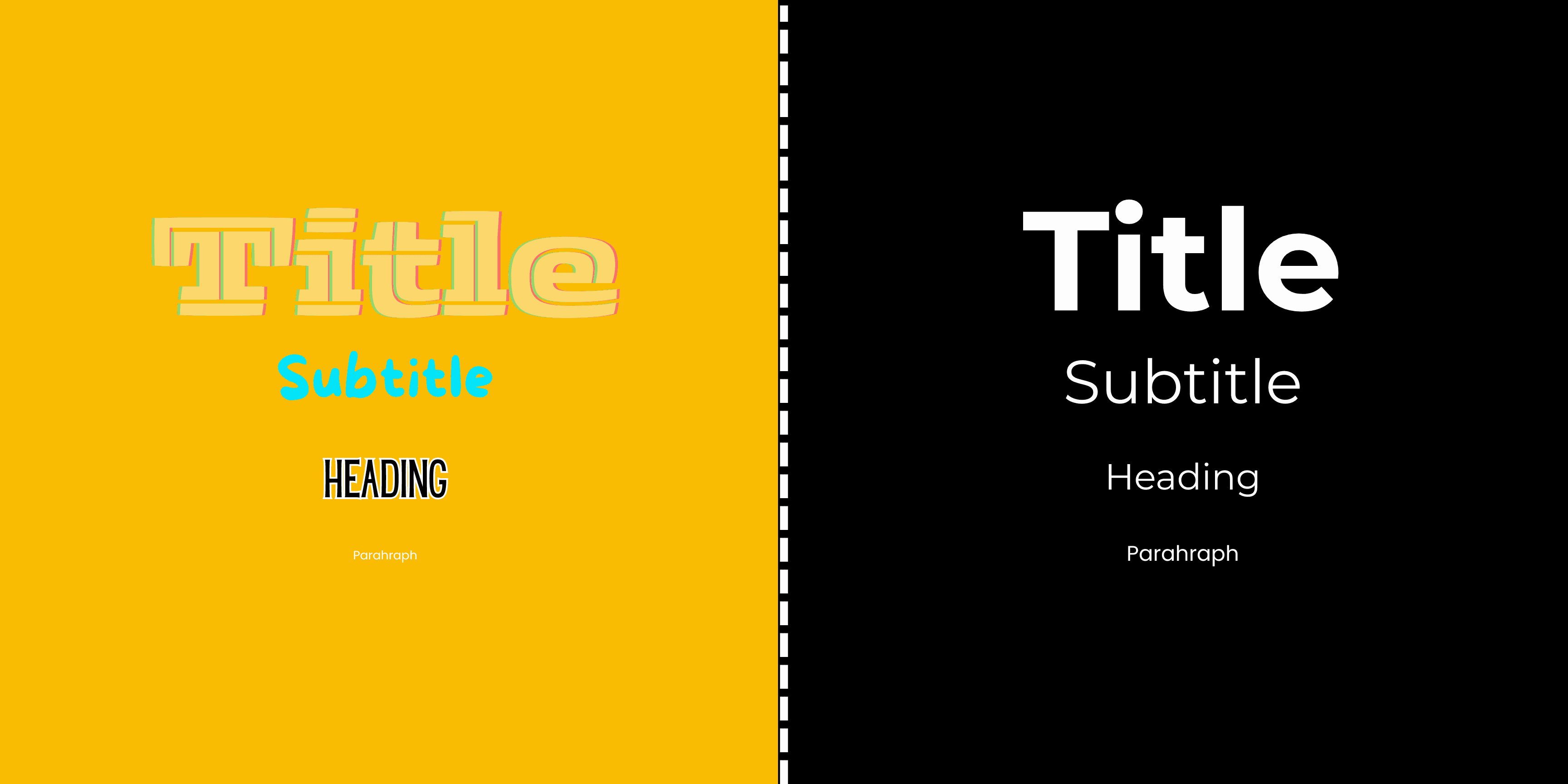
4. Your Typography Looks Cool But Feels Unreadable
Typography is the primary way people consume your content. If it’s hard to read, it doesn’t matter how brilliant your message is it might as well not exist. Design is not just about looking good. It’s about working well. And type is your interface’s voice. Typography isn’t just about personality it’s about performance.
4.1 Typography Is More Than Style It’s a Tool for Clarity
Typography isn’t just about choosing a pretty font. It’s about how people read and absorb your message. You can have the smartest copy and most valuable offer on your site but if it’s set in ultra-light gray, packed into 12px lines, or center-aligned across the entire page, it won’t get read. Period.
Typography should reduce friction, not create it. Your type decisions affect readability, accessibility, information hierarchy, SEO, and even how trustworthy your brand feels. Designers often prioritize aesthetic “mood” over readability. But here’s a truth bomb: If your site looks great but people struggle to read it, it doesn’t matter how beautiful it is.
4.2 Readability = Retention
Reading on screens is already harder than print. People skim. They scan. They glance. So your type has to be scannable.
That means: (Short paragraphs, Clear heading hierarchy, Line height between 1.4 and 1.7, Font sizes that scale across devices, Maximum line length of ~70–80 characters) When text is structured properly, users stay longer because it feels effortless to keep reading.
We worked with a content-driven platform that bumped its body text from 14px to 17px, cleaned up its heading hierarchy, and simplified to just two font styles. Result? Average time on page increased by 28%. Just from typography.
4.3 Accessibility Isn’t Just a Buzzword
Approximately 2.2 billion people around the world live with some form of vision impairment. When websites rely on low contrast text, tiny fonts, or inconsistent spacing, they don’t just create a slightly worse experience they actively exclude people. If your paragraph text is light gray on a white background, or if links are visually indistinguishable from body copy, you’re building walls where there should be open doors.
At the very least, your text should meet WCAG AA contrast guidelines. Tools like WebAIM’s Contrast Checker can help ensure you meet the 4.5:1 ratio required for normal-sized text. Your fonts should be resizable without breaking the layout, so users who increase text size aren’t punished with jumbled designs. Headings should follow proper semantic HTML structure using H1 for main titles, then H2, H3, and so on. This doesn’t just help screen readers, it also supports SEO and content clarity. And wherever possible, avoid using images of text. These can’t be read by assistive technology and often fail to scale properly across devices.
Accessibility isn’t just a checklist item. It’s a requirement legally in many places, and ethically everywhere. If your site isn’t accessible, it isn’t complete
4.4 Typography Also Impacts SEO
Search engines don’t “see” your fonts but they do care how your content is structured. When you use proper heading levels (H1 for page title, H2 for major sections, etc.), it tells Google and screen readers what your content is about. On the other hand, if you style a random <div> to look like a heading, you’re doing visual design only not semantic design. And that hurts both SEO and assistive technology users. Good typography supports clarity, which supports discoverability.
4.3 The Fix: Design for Eyes, Not Aesthetics Alone
To make sure your typography actually works for your audience, start with the basics. A body text size of 16 to 18 pixels strikes the right balance between readability and visual harmony across devices. Pair that with high-contrast color combinations think dark text on light backgrounds or the reverse to ensure legibility, even in low-light settings.
Stick to one or two typefaces throughout your site. This not only keeps your visual identity cohesive but also reduces cognitive load. For body copy, always opt for left-aligned text. It’s easier for users to scan, especially on mobile screens where centered or justified text can become chaotic.
Make sure your heading structure follows a clear and logical hierarchy. Proper use of H1, H2, and H3 tags improves both usability and SEO. And don’t rely on mockups alone test your typography on real devices, especially smartphones, where most users will encounter your content.
Great typography shouldn’t call attention to itself. It should disappear into the background, quietly guiding users through your message. When it works well, users won’t even notice it they’ll just keep reading, effortlessly.
5. You’re Prioritizing Trends Over Clarity
In today’s design culture, it’s easy to chase what's visually impressive rather than what's functionally effective. With platforms like Dribbble and Awwwards showcasing avant-garde websites, many teams feel pressure to “look modern” even if it compromises usability.
But here’s the hard truth: your site isn't here to impress other designers. It's here to help real people accomplish real goals. And when trendy visuals get in the way of clarity, performance suffers no matter how gorgeous the layout is.
5.1 The Problem with Trend-First Design
Trendy visuals are seductive. Neumorphism, brutalism, parallax scroll effects, floating glass cards they look amazing on Dribbble and Behance. They win design awards. They get shared on Twitter. And yet, they often do more harm than good when applied to real websites used by real people.
Why? Because trends tend to prioritize style over clarity. They’re designed to impress, not to help users accomplish tasks. They often sacrifice usability for novelty and the result is an experience that looks good but feels frustrating. Design isn’t art. It’s communication. If a trend enhances clarity, great. But if it makes your interface harder to use, it’s just noise.
5.2 When Is It Worth Using Trends?
Let’s be fair: not all trends are bad. In fact, some modern design patterns improve UX when used intentionally.
1. Microinteractions can guide attention subtly (e.g. a button that slightly pulses to draw the eye). 2.Dark mode offers visual comfort in low-light environments, reducing eye strain for many users. 3.Bold, oversized headings can help users scan faster and understand page structure more intuitively. 4. Clean white space improves focus and hierarchy, especially on mobile.
These trends are rooted in enhancing the user experience, not just aesthetics. The key is asking: What does this trend actually do for the user?
5.3 Why Trend-First Design Backfires
We recently reviewed a startup’s freshly redesigned homepage. It looked incredible the kind of sleek, animated layout that would win hearts on Dribbble. The visuals were clean, the font was modern, and the UI had that subtle, high-end tech vibe.
But here’s what actually happened after the redesign launched: People were confused. Navigation was tucked into a hover-only menu with vague labels. Key content was hidden behind carousels and modals. CTAs used icons with no text. It all looked premium but didn’t work for regular users who just wanted answers. No one said it was “ugly.” But during testing, most people just… gave up. They couldn’t tell what the product did. They weren’t sure what to click. They left without converting. The issue wasn’t the visuals. It was the lack of clarity.
5.4 The Fix: Function First, Always
Trends aren’t inherently bad they just need to serve a purpose. Use them to highlight content, support a flow, or reinforce hierarchy. Don’t use them just because they’re popular on a showcase site.
Ask this about any trend you’re considering: (Does this make the content easier to read?, Does it guide the user toward a desired action?, Does it work just as well on mobile, tablet, and slower connections, Would a non-designer immediately understand how to use it?)
If the answer to any of those is no rethink it.
“Users prefer sites that let them accomplish their tasks easily and efficiently not ones that merely look modern.” NN/g on Aesthetic-Usability Effect
Bonus: Why UX Clarity Also Boosts SEO
While your users feel the pain of bad UX first, Google does too. Sites that are confusing, slow, or overly complex get penalized even if they look great. Google’s core updates increasingly factor in user experience signals, including: Mobile-friendliness and Core Web Vitals (loading speed, interactivity, visual stability), Semantic structure that aids indexing, Clear, trustworthy content with strong internal linking, Low bounce rates and high engagement.
UX Clarity Checklist
Before launching (or relaunching) your website, run it through this quick clarity checklist:
Navigation is clear, consistent, and limited to 5–7 top-level items.
CTAs have one clear primary action per page, with supportive microcopy.
Buttons are visually distinct and interactive, with obvious hover/tap states.
Typography is easy to read, uses a logical hierarchy, and meets contrast standards.
Trends support clarity instead of overshadowing it.
If you can check these off confidently, your website is on the right path.
Frequently Asked Questions!

The Fun Side of Content Production: Why It Matters
Content creation is often seen as a technical process—one that requires planning, strategy, and execution. However, there’s an essential element that is overlooked: fun.

Why Businesses Can No Longer Ignore Video Marketing
Whether it’s short-form videos on TikTok and Instagram or long-form brand storytelling, video content is now the gold standard in content marketing.

The Shift to Short-Form Content: How to reach your audience
These bite-sized videos, often no longer than 60 seconds, are ideal for capturing attention in a fast-paced digital landscape where consumers crave quick, digestible content.